Interior inspiration: these are the 3 colour trends for 2023
What are the current colour trends? From earthly to fresh and bold: discover the top three colours here. Interior stylist Evelyne van Vlerken from Jackie Woo shares useful tips to bring these colours to life.
Colour trend #1: terracotta
Literally translated terracotta means baked clay. Why is this colour so popular? The earthly mix of red, orange and brown reminds people of holidays and southern warmth. Evelyne van Vlerken of interior agency Jackie Woo explains: “Colour has a psychological effect, as it determines the temperature at home. For example, a red room with a temperature of twenty degrees feels warmer than a blue room.”
Terracotta conveys a sense of calmness and relaxation and is therefore a great choice for your bedroom. Why not add a touch of additional warmth to the room in which you both start and end your day? Alternatively, you can use it as an accent in your living room so that your family and friends can also enjoy the warmth of terracotta.
Evelyne: “Terracotta is suitable for use in various interior styles, such as a bohemian style decor. Combine this colour with natural materials such as rattan, wood or airy linen. Or webbing, a kind of rattan wickerwork. Beige concrete, cork or copper also look great with terracotta.”
Boho style interiors often feature plaster walls with a rough and earthly finish. “The wall colour often looks as if it was applied with sweeping strokes and structure to give it a ‘back to the roots’ look.” A good alternative would be Kasba wallpaper that shows a similar texture.

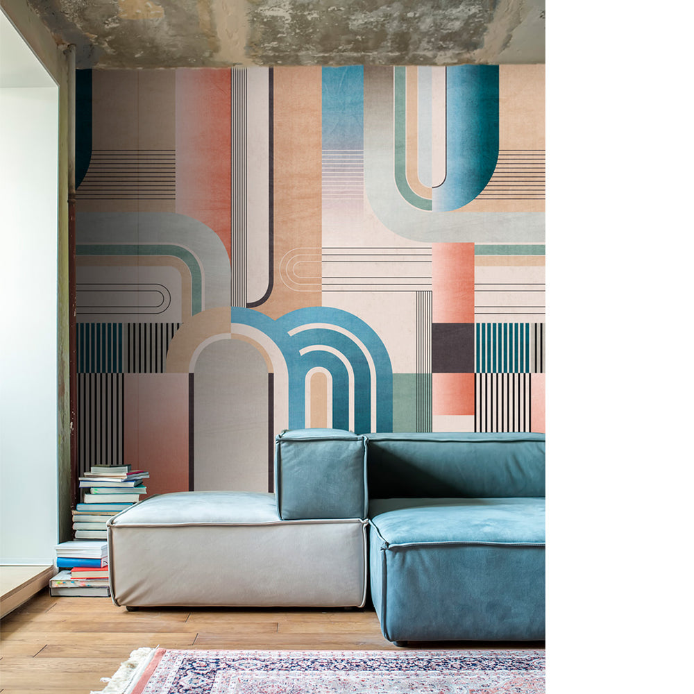
In a modern interior, terracotta is combined with sleek, geometric shapes. “This gives the room an industrial or Scandinavian character, depending on the tones that are used: keep them sleek and dark for an industrial interior and soft and light for a Scandinavian look.” You can see these subdued colours in the artistic sections of Collage and the curves on the Colonnade wallpaper.
“Smooth marble is a great choice for modern interiors, as is brass. This gold-coloured material adds a luxury touch.”
Is a classic style more your thing? In that case, the cracked earth look of Texture wallpaper is the perfect choice for you. “Terracotta matches with elements that make your classic interior more robust and heavier. Think leather, linen sofas and wide, wooden shelves or large pieces of furniture.”
You can match the other colours you use to finish the room to your personal style. “If you are after a light and serene look, I suggest you use subdued colours such as pink, beige or white”, says Evelyne. “Or you can apply the ton sur ton trend: you use the same colour but in different tones, such as brown, red and orange. If you use dark, main colours you can opt for contrasting colours, such as cool grey for example. Or you can use a bold yellow for a more playful effect.”
Colour trend #2: green
Cool and warm green tones are making a comeback with a wink to Mother Nature. Pastel green brings a fresh look to your bedroom, while dark green creates the relaxed feel of a hotel room. This colour really comes into its own in a study as green helps you focus and reduces stress levels”, explains Evelyne.
The actual green colour tones depend on your interior style. Fresh apple green reminds you of a retro interior, as does old green. Create a really nostalgic room ambience by adding Chevron wallpaper with a herringbone pattern. “Use materials associated with the past such as dark wood, velvet and vintage furniture with colour accents.”
The mix of green and grey on Duotone wallpaper works a treat in a modern, industrial interior. Create the ultimate loft feeling by adding furniture statement pieces and raw materials such as steel or brick to your room.

A Scandinavian interior tends to use light or pastel greens, whilst a boho style room often has a lot of dark green in it. “You can combine those shades with light wood, rattan, linen and plants to achieve a natural look. Add brass details and hey presto! You get an instant wow effect.”
By the way, there is no need to limit yourself to just one shade of green either, says Evelyne. “Use ton sur ton for a layered effect and to create depth. For example, use light green as a base colour and dark green as an accent colour. A moss wall is another interesting feature you can add to your home. This is a wall with real plants.”
Panoramic wallpaper with a nature print, such as Green Jungle, is a popular alternative for walls where shades of green take centre stage. This option is highly recommended if you want to make a maximum impact with very little effort. “You can really let your creativity run wild in small spaces with very little furniture, such as halls and toilets. It is best to use this wallpaper for an accent wall if using it in your living room, bedroom or bathroom.”
Add soft, neutral basic colours such as white, beige, taupe or grey for a sense of tranquillity and balance. If you are a fan of subtle colour blocking, you can mix pastel green and pastel pink, for example. Do you prefer bolder colours? Opt for pink, blue or purple since these are colours that contrast with green.
Colour trend #3: colour bomb
If you are out to make a real statement with your room, may we suggest colour bomb? Colour bomb is a home decorating trend full of colour that adds playfulness and vibrancy to a space. This popular phenomenon uses colour blocking to combine contrasting colours. “Bold colours not only add personality but also make your room seem bigger”, says Evelyne.
What rooms are most suited to such a colour bomb? You can use colour bombs anywhere, from the smallest room right down to your living room. “Such a mix of colours can add energy and inspiration to any office space, particularly if you have a creative job. Or you can use colour bombs in children’s bedrooms to add positive energy.”
There are no limits as far as smaller rooms are concerned. “But dosing remains important when it comes to the rest of your home. Work with an accent wall and use the basic colours of white, black or grey for your other walls for a cosy and serene feel.”
Colour bomb brings to mind retro interiors that use colours such as green, orange, blue and yellow. This mix is reflected in various patterns, including the XL-flower print of Honey wallpaper or the Color Blocks wallpaper.

Do you like to give your room a retro twist but with softer colours? Travel back in time with the baroque shapes of Vintage Twist or the art deco look of Arc wallpaper. The use of these subdued colours will remind you of a typical Scandinavian interior style.
“It all depends on the intensity of the colours and the effect that you want to achieve. If you work on the principle that ‘the brighter, the better’, you will end up with an eclectic interior with various colours and patterns. Black & white prints combined with gold, wood or antique: anything is possible.” The idyllic coastline of Rivièra wallpaper would look perfect in such an interior.
What final touches look good with a colour bomb interior? “Soft, rich fabrics such as velvet or satin but metal will also look great. And wood, but in dark brown, black or white”, concludes Evelyne.
Would you like to get more inspiration for your interior? Have a look at our exclusive Wallhaus wallpaper collection.
We are grateful to Evelyne van Vlerken for all tips and tricks. With her company Jackie Woo, Evelyne provides advice for fans of interior design like you, and furnishes houses for estate agents and project developers.
WallHaus x Sundae: Meet our new collab
After nine years as the founder of Roomblush, Eline Rousseau has decided to start a new project. In 2022, she launched her new interior design concept: Sundae.
These are the 3 main interior trends for 2023
Ready to upgrade your interior? Get your inspiration from the three hottest home decor trends of the moment. Interior stylist Evelyne van Vlerken from Jackie Woo explains how you can apply these ideas to your own favourite rooms.